hab
How I designed MVP that balances between business and users needs that propelled hab to the next stage
June 2023 - Feb 2024
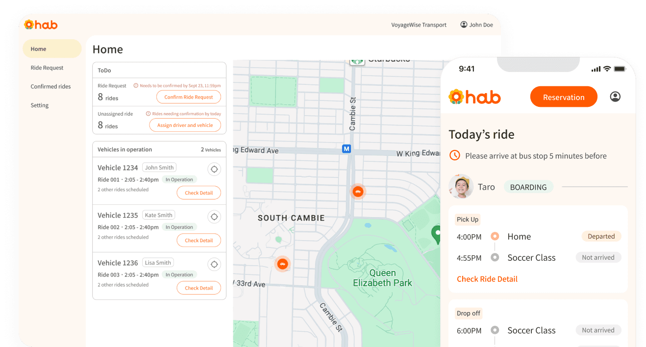
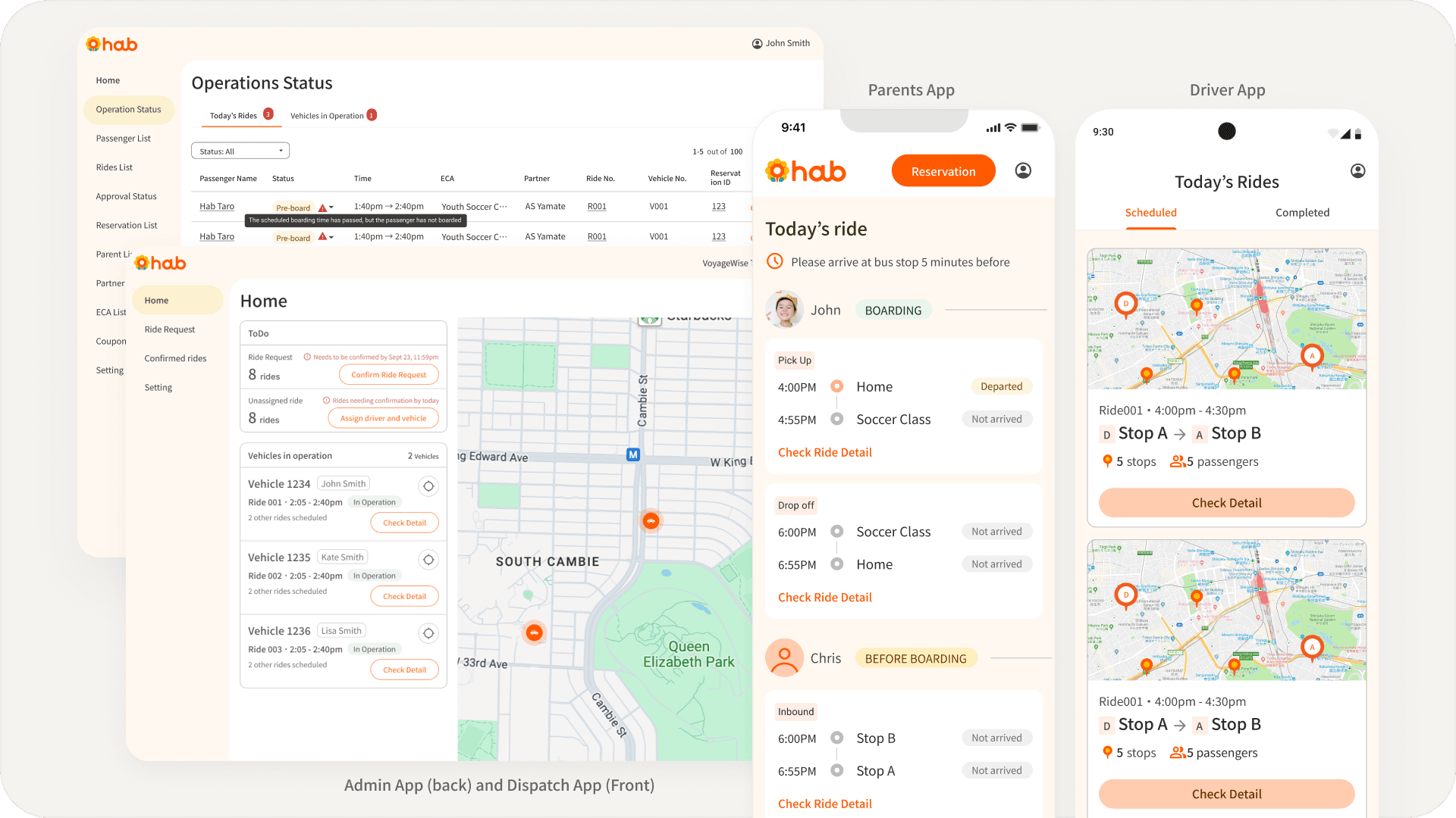
Dispatch app and parents app (Translated to English)
What is hab?
Parents often have to sacrifice work hours or personal time to transport their children accessing extracurricular activities
hab is a ride-sharing platform for children specifically to solve the burden on parents
Goal
To build a minimum viable version of the ride-share platform to test the feasibility of the platform
Outcome
My design contributed to validating users' needs through the pilot test with 20 users
The pilot test result:
Ride-share solution effectively solves parents' issue
Parents are happy to pay the current price
The current pricing model does not cover the operational cost and lacks sustainability
This result helped hab to move forward to the next step to scale its business. hab opted to partner with a leading transportation company, offering its software under their brand
Design process
Initial Actions
I began my work by reviewing existing documents such as user surveys and reflections from the last pilot test to understand user needs as we had a tight deadline and I was not sure if we had enough time to do user research.
Understanding the big picture beyond digital experience
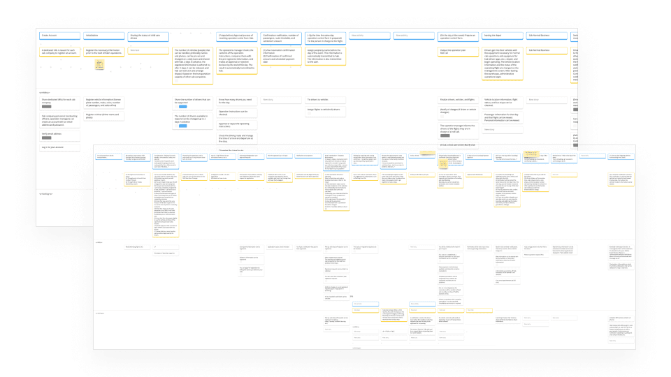
I drafted service blueprints to visualize the roles and interactions of different stakeholders (parents, children, drivers and admin) as I felt a need to quickly grasp the entire service process in a user-centric way after catching up on project documents and discussions with the CEO,
I brought this to workshop with the CEO and lead developer and we reviewed this together. This helped me understand the ideal user journey, but also highlighted the need to further understand user pain points and evaluate if our solutions ideas would actually help them.
Service Blueprints
Evaluating the potential solutions
We initially assumed affordability and safety were their primary concerns when outsourcing transportation. We sought to evaluate how our potential solution, ride-sharing, pre-defined pick-up/drop-off locations and other ideas, could help parents reduce the burden while ensuring safety for parents to confidently entrust their children with the service
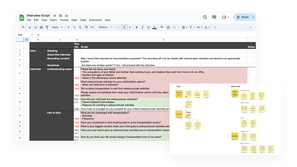
After conducting 5 in-person interviews with parents facilitated by the CEO, we found out that while initial assumptions, affordability and safety, were partially correct, but revealed a higher need for more guaranteed and reliable transportation
This finding led to a shift in focus, prioritzing features that ensures consistent and dependable service such as monthly booking system rather than one-time booking
Interview script(left), part of analysis (right)
Breaking down to requirement
After the interview, in order to define the scope for MVP, I wrote user stories, then prioritized based on safety and reliability, ensuring the MVP focused on the most impactful and essential features for the pilot test.
However, the prioritization process was challenging for me, as there was a lack of clarity in terms of what needed to be validated through the pilot test, and I regretted not addressing this earlier. Fortunately, CEO and I identified key hypothesis we wanted to validate and also metrics for measurement. We also defined functionalities to exclude or defer during this initial phase.
Iterating, Iterating, Iterating
During my design process, I needed to make sure everything was aligned in 4 different apps, covering all the information that needed to be gathered and displayed, and simplifying it as much as possible. To achieve this, I went back and forth between user & operational flow, data model and interface design
User & Operational flow
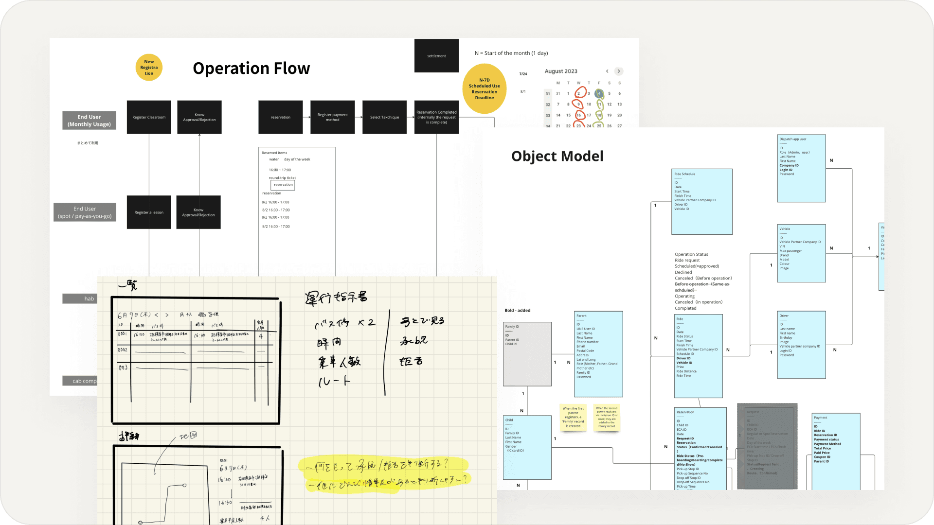
Mapped out user inputs, triggers and approval processes and interactions between platforms, ensuring integration
Data model
Defined core entities, attributes, and relationships for a shared understanding by collaborating with lead developer. I felt the need to do this because the same object or data was displayed differently throughout the apps.
Sketching & Wireframing
Listed out what information needs to be displayed to achieve the user story and usually start from sketching. After I moved to Figma, I wireframed all the screens
Operation Flow (Left Back), Sketches(Left Front), Data Model (Right)
Finalizing the hi-fi design and handing off to developers
In order to launch on time for the pilot test and reduce frontend workload, I proposed to use MUI, a react component library, but reflected our brand identity to those components. During this process, the brand identity was updated but using the existing component helped to reduce the design workload and quickly reflect the changes too
The development team was outsourced and cost was based on wireframe design, limiting design changes from mid-fi to hi-fi. However, there was a need for further design iterations that arose due to new findings. The team was hesitant to make changes at first but after communicating the business impact the changes would bring, a compromise was reached to implement feasible changes
hab platform (translated)
